Lowering bills, cutting carbon
You may have noticed that Big Clean Switch has a new look. Here we explain the reasons behind our rebrand and the thinking behind our bold new logo.*
Our old brand had served us well ever since our launch in 2016, but was increasingly feeling tired and out of kilter with the excitement and passion we want people to feel when they switch to green energy – they’re helping to save the planet after all!
We wanted our rebrand to better reflect our core values. It needed to be simple and feel human and approachable, but also fresh and exciting. And it needed above all to say ‘trust me’, reflecting the due diligence we do on the suppliers we work with, and the support we offer our users when they switch through us.

The starting point for our ‘butterfly’ logo was the infinity symbol, reflecting our mission to transition the world from dirty, finite fossil fuels to renewables with an almost infinite supply.
The two sides of the logo represent our partnerships with organisations great and small, which remain the backbone of our business.
And the logo is also a symbol of positive change. Just as a caterpillar morphs into the butterfly, we’re transforming the energy system for the better. A single flap of a butterfly’s wings is sometimes said to have huge repercussions. That, in a nutshell is at the heart of what we do: Empowering small actions that can change the world.
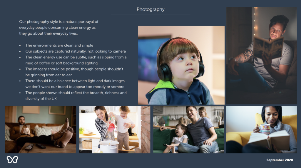
At the same time as replacing our logo, we’ve also adopted a new approach to how we bring switching to life for our users. While we love images of wind turbines and solar panels, we’ve found they feel distant for our users, unrelated to their everyday lives. So, wherever possible, we now try to bring our content to life with images of energy use in the home, reflecting the thousands of people we’ve already helped make the switch to green energy. We’re also committed to trying to use the imagery we use to reflect and champion the breadth and diversity of the population of the UK.
Beneath the rebrand, of course, our business is still underpinned by the same fundamental belief that switching to renewable energy should be as easy as possible for everyone, and a desire to help homes and businesses to make that change in whatever way we can.
* We’re indebted to the inspirational team at Mere Mortals for our new look. They helped us better understand who we are and what makes us different, and to express that through a vibrant brand that conveys the excitement and passion that goes with helping to save the planet!


